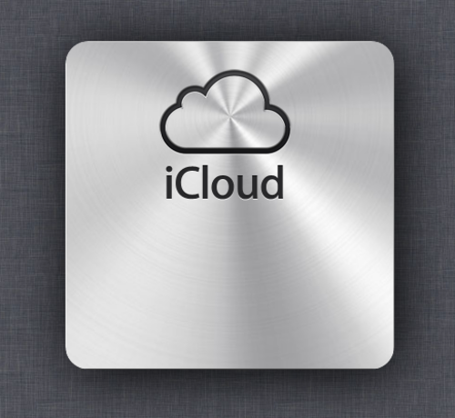
iCloud Shimmer Effect
Today Alex pointed out the new iCloud website had lot's of fancy effects. One I liked best was the polished metal effect on the login box that shimmered when you moved your mouse.
I went ahead duplicated it as best I could in a short time. There are some obvious differences in approach, but it's essentially the same.
One thing I did not do was the easing on the mouse move. I really like that, but it would be time consuming to get it running.
Also, I'm not browser compatible. I only tested it in Chrome 14.
Most of the work is done in two functions.
mousemove takes the mouse position and converts it to a degree of rotation.
mousemove: function ( event ) {
  // Use the mouse x coordinate conbined with the window width to
  // come up with a degree to rotate.  You can make it more responsive
  // by decreasing the reduction.
  var reduction = 200;
  var deg = ( window.innerWidth / 2 - event.clientX ) * -1 / reduction;
  if( deg != Shimmer.current_rotation ) { Shimmer.draw( deg ); }
}
draw rotates the canvas and draws the image onto it.
// Rotate the metal background
draw: function ( deg ) {
  Shimmer.current_rotation = deg;

  // Clear the canvas
  Shimmer.context.clearRect( 0, 0, Shimmer.canvas.width, Shimmer.canvas.height );
  Shimmer.context.save();

  // Set the rotation point at 50% from left and & 80px from top
  Shimmer.context.translate( Shimmer.center.x, 80 );

  // Rotate by degrees (convert to radians)
  Shimmer.context.rotate( deg * Math.PI / 180 );

  // Draw metal
  Shimmer.context.drawImage( Shimmer.image, Shimmer.offset.x, Shimmer.offset.y );

  // Clear transforms
  Shimmer.context.restore();
}
That's essentially it. Simple, but visually powerful. The source is embedded in the demo and commented.